Icon:


Index:


Symbol: 'DOG', 'Car', 'Domino's Pizza'
2) Why are icons and indexes so important in media texts? Icons are extremely important in media texts because it shows you what is being presented and indexes are really important as well because it shows you evidence of what is being presented, the indexes backs up the icons.
3) Why might global brands try and avoid symbols in their advertising and marketing? Global brands might try and avoid symbols in their advertising and marketing so consumers will only remember the brand for its name rather than just the symbol.
4) Find an example of a media text (e.g. advert) where the producer has accidentally communicated the wrong meaning using icons, indexes or symbols. Why did the media product fail?
 In this Starbucks advert, the producer has accidentally communicated the wrong meanings with the two cups next to each other on the grass and there is a dragon fly that looks like it is about to crash into the cups. This advert poster was made in 2002 and in 2001 there was a terrorist attack in America when a plane flew into the twin towers. This led to the twin towers being destroyed. People would see this advert poster as a reconstruction of 9/11 even if it was unintentionally done. The wrong message was given out to the consumers and led the media product to fail. The two Starbucks cup is the icon however the index could be the twin towers. The dragon fly is the icon however the index is the plane that crashed into the twin towers.
5) Find an example of a media text (e.g. advert) that successfully uses icons or indexes to create a message that can be easily understood across the world.
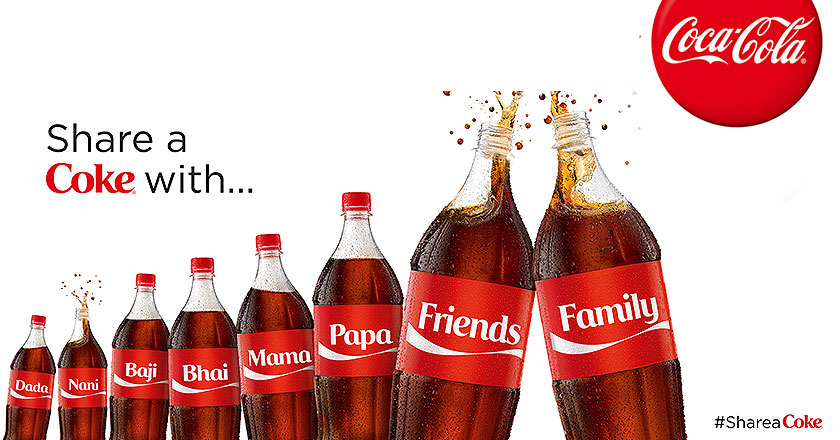
This Coca Cola advert was successful as it involved all the consumers as they were able to get their name personalised on the Coca Cola bottle. The icon of this advert was Coca Cola with their glass bottles and the red layout. The index is the red label that is on the bottle so people recognise that it is Coca Cola. People would easily recognise this is Coca Cola as they will be able to realise the red layout with the design at the bottom. Coca Cola was able to attract consumers towards their product as this marketing campaign allowed consumers to personalise the label and put their name on it.
No comments:
Post a Comment